Five Main styles of Chinese character calligraphy art

The are five main styles in Chinese Calligrahy art. They are small seal scipt/ style, official/clerical script, Semi-cursive script (Running Script), Cursive script (Grass Script), and Formal/Regular Script (Standard Script).

From the seal script was derived the clerical script; and from the clerical script were derived both the regular script and the cursive scripts.

Characters are often written in ancient variations or simplifications that deviate from the modern standards used in Chinese, Japanese, or Korean. Modern variations or simplifications of characters, akin to Chinese Simplified characters or Japanese shinjitai, are occasionally used, especially since some simplified forms derive from cursive script shapes in the first place.

The Japanese syllabaries of katakana and hiragana are used in calligraphy; katakana were derived from regular script shapes and hiragana from characters in the cursive script. In Korea, the post-Korean War period saw the increased use of hangul, the Korean alphabet, in calligraphy.

Seal Script

seal script
The Seal Script (often called Small Seal Script) is the formal script of the Qin system of writing, the informal script of which was precursor to the Clerical Script. Seal script is the oldest style that continues to be widely practiced. Today, this ancient style of Chinese writing is used predominantly in seals, hence the English name. Although seals (name chops), which make a signature-like impression, are carved in wood, jade and other materials, the script itself was originally written with brush and ink on paper, just like all other scripts.

Most people today cannot read the seal script, so it is generally not used outside the fields of calligraphy and carved seals. However, because seals act like legal signatures in Chinese culture, Korean culture, and Japanese culture, and because vermillion seal impressions are a fundamental part of the presentation of works of art such as calligraphy and painting, seals and therefore seal script remain ubiquitous. ( more about seal script... )

Clerical/Official Script

clerical style
The Clerical Script (often simply termed lìshū; and sometimes called Official, Draft or Scribal Script) developed from the Seal Script. In general, characters are often "flat" in appearance, being wider than they are tall. The strokes may appear curved and with variations in width. Most noticeable is the dramatically flared tail of one dominant horizontal or downward-diagonal stroke, especially that to the lower right. This characteristic stroke has famously been called 'silkworm head and wild goose tail' (蠶頭雁尾 cántóu yànwěi)in Chinese due to its distinctive shape.

The archaic Clerical Script of the Chinese Warring States period to Qin Dynasty and early Han Dynasty can often be difficult to read for a modern East Asian person, but the mature Clerical Script of the middle to late Han dynasty is generally legible. Modern works in the Clerical Script tend to use the mature, late Hàn style, and may also use modernized character structures, resulting in a form as transparent and legible as Regular (or standard) Script. The Clerical Script remains common as a typeface used for decorative purposes (for example, in displays), but it is not commonly written. (More about Clerical Style ... )

Semi-cursive Script

semi-cursive style
The Semi-cursive Script (also called Running Script, 行書) approximates normal handwriting in which strokes and, more rarely, characters are allowed to run into one another. In writing in the Semi-cursive Script, the brush leaves the paper less often than in the Regular Script. Characters appear less angular and rounder.

In general, an educated person in China or Japan can read characters written in the Semi-cursive Script with relative ease, but may have occasional difficulties with certain idiosyncratic shapes. ( More about Semi-cursive Style ... )

Cursive Script

cursive script
The Cursive Script (sometimes called Grass Script, 草書) is a fully cursive script, and a person who can read the Semi-cursive Script cannot be expected to read the Grass Script without training. Entire characters may be written without lifting the brush from the paper at all, and characters frequently flow into one another. Strokes are modified or eliminated completely to facilitate smooth writing and to create a beautiful, abstract appearance. Characters are highly rounded and soft in appearance, with a noticeable lack of angular lines.

The Cursive Script is the source of Japanese hiragana, as well as many modern simplified forms in Simplified Chinese characters and Japanese shinjitai. ( More about Cursive Style.. )

Regular Script

The Regular Script (often called standard script or simply kǎishū) is one of the last major calligraphic styles to develop, emerging between the Chinese Han dynasty and Three Kingdoms period, gaining dominance in the Southern and Northern Dynasties, and maturing in the Tang Dynasty. It emerged from a neatly written, early period semi-cursive form of clerical script. As the name suggests, the Regular Script is "regular", with each of the strokes placed slowly and carefully, the brush lifted from the paper and all the strokes distinct from each other.

The Regular Script is also the most easily and widely recognized style, as it is the script to which children in East Asian countries and beginners of East Asian languages are first introduced. For learners of calligraphy, the Regular Script is usually studied first to give students a feel for correct placement and balance, as well as to provide a proper base for the other, more flowing styles.

In the Regular Script samples to the right, the characters in the left column are in Traditional Chinese while those to the right are in Simplified Chinese. ( More about Regular Script... )

wikipediaThis article is licensed under the GNU Free Documentation License. It uses material from the Wikipedia article "Wikipedia".

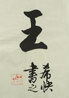
Elementary knowledge of rubbings from stone tablets

In learning calligraphy it is necessary to copy rubbings from stone tablets. How do we choose these rubbings? As a nation of calligraphers China has thousands of rubbings from stone tablets. Opinions may differ on the same stone tablet-praised by some and scorned by others. They are controversial. My own opinion is that the learner should choose rubbings of the four great schools of calligraphy-Yan, Liu, Ou and Zhao. The four have distinct features. The Ou school is marked by characters of strength. The Yan school produces characters with strong sinews or powerful framework. The_ characters of the Liu school are compared to the bones of the body. Zhao characters are compared to the flesh of the body. A description of each follows.

Yan Style of Calligraphy

Yan Zhenqing (709-785) was also known as Yan Qingchen. His ancestral home was Wannian, Jingzhao (now Xi'an, Shaanxi Province). He himself said that he was a native of Langya (now Linyi, Shan-dong Province). A prominent official in the Tang Dynasty, he was titled Duke of Lu Commandery. People respectfully called him Yan Lu Gong. He was a great-calli-grapher at the height of the Tang Dynasty's power and glory. An early representative work was Duo Bao Ta Bei. A fine work representative of his middle era was Dong Fang Shuo Hua Xiang Zan Bei. Yan Shi Jia Miao Bei was a powerful work representative of his later years. The style of his calligraphy is bold and vigorous, showing spaciousness and breadth.

Before Yan Zhenqing formed his own calligraphic system, most calligraphers had followed or imitated the calligraphy of Wang Xizhi and his son, Wang Xianzhi. The Wang style is for the most part natural and unrestrained, elegant and refined. It can be compared to a romantic Chinese scholar or a classic Chinese beauty. Wang Xizhi's style is truly beautiful. However, it lacks strength and vigor. The atmosphere of Yan Zhenqing's calligraphy may be compared to the imposing appearance of a marshal, or it is as majestic as a sovereign ruler. The style has grandeur and loftiness. Like the poetry of Li Bai and Du Fu, Yan calligraphy embodies the grand spirit of the Tang Dynasty as its height. Yan calligraphy is as robust as the sun. After Wang Xizhi's time (Jin Dynasty) Chinese calligraphic art reached an epoch-making peak with the appearance of Yan Zhenqing's calligraphy. It became the fashion in the Song Dynasty to take Yan's calligraphy as a model for copying. This has persisted to this day, over a thousand years later.

There are many Yan-style rubbings from inscriptions on stone tablets. To copy small characters, get Ma Gu Shan Xian Dan Ji. To copy medium-sized characters, try the rubbing entitled Duo Bao Ta Bei. For big characters, try Yan Shi Jia Miao Bei.
Yan Zhenqing, Duo Bao Pagoda Stele, Tang Dynasty (regular script)

Liu Style of Calligraphy

Liu Gongquan (778-865), alias Liu Chenxian, was a native of Huayuan, Jing-zhao (now Yaoxian County, Shaanxi Province). A leading official of the Tang Dynasty, he was titled Duke of Hedong Commandery and popularly called Liu He Dong. A great calligrapher of his time, he was ranked alongside Yan Zhenqing as one of two great calligraphers. The two were referred to as Yan-Liu. Forthright, Liu had great integrity and was not careless. He was candid in giving his views. When the emperor asked him how one could write upright characters, he replied that it depended on the mind of the writer. When a man set the purpose of his life right, he would be able to write upright characters. On hearing this, the emperor's expression changed, as he thought that Liu was reprimanding him. This episode was described by later generations as cal-ligraphically reprimanding the emperor. Liu Gongquan was speaking of the relationship between the mind and the brush. Before setting brush on scroll to paint bamboo, the painter must have the shape of the bamboo in his mind. In the same way a calligrapher sets his mind on the shape of characters before he actually writes them. This approach is common to both painting and calligraphy. The style of Liu calligraphy may be compared with the integrity of the calligrapher. The framework is very strictly executed. The style is strict and rigorous. Those wishing to imitate Liu's style in small characters may get copies of rubbings known as the Diamond Sutra and GUI' Lin Shi. For medium-sized characters obtain a copy of the rubbing called Tang Jian Yi Da Fu Bei. For big characters Xuan Mi Ta Bei and Shen Ce Jun Bei are excellent specimens.
Liu Gongquan, Xuanmi Pagoda Stele

Ou Style of Calligraphy

Ouyang Xun (557-641), also known as Xinben, was a native of Linxiang (now Changsha, Hunan Province). He was also a leading official of the early Tang Dynasty, serving the crown prince. The framework of characters in Ou calligraphic style is very rigid. His characters have strength, and his style has solemnity and grace. Recommended rubbings in Ou calligraphic style are: Jiu Chen Gong Li Quan Ming, Hua Du Si Bei, Huang Fu Dan Bei and Yu Gong Gong Wen Yan Po Bei.
Ouyang Xun, Jiucheng Gong Liquan Ming, (Commemorative Stone Tablet for the Beneficent Spring near the Palace Jiucheng)

Zhao Style of Calligraphy

Zhao Mengfu (1254-1322), alias Zi'ang and Xuesong Daoren, was a native of Huzhou (now Wuxing, Zhejiang Province). His style is mellow and full, handsome and rather refined, not at all vulgar. The structure is compact and well proportioned. We find flexibility that is rather natural. The running script is particularly graceful and elegant.

Sometimes the technique of writing in Zhao style appears to be more dexterous than required, resulting in lack of strength in the brush stroke. The calligraphy of Zhao Mengfu's later years is more mature, with vigorous strokes that display power.

Rubbings of inscriptions from stone tablets in Zhao style are as follows: Dao De Jing (in small characters), Da De Fa Shi Bei (in medium-sized characters), and Dao Jiao Bei and Miao Yan Si Bei (in big characters).

Of the four schools of calligraphy listed above Zhao style appears the easiest to learn. Beginners, however, with little basic skill, may find that their writing lacks strength if they start with Zhao style. This point should not be overlooked. If they begin their learning process by imitating Yan, Liu or Ou styles instead, they will gain strength in their writing. They may learn Zhao style later. This will enable them to add mellowness and fullness to their calligraphy. Their writing will have strength plus elegance. The bones will take on flesh, as it were. They will improve an already good script.

Apart from the four schools of Chinese calligraphy there are the works of Zhong You and Wang Xizhi, originators of regular script. Their works have won respect and high praise from calligraphers through the ages.

The above is elementary knowledge about rubbings of inscriptions on stone tablets used as writing specimens. Each school is different from the other and cannot be treated in the same way. The choice of rubbings depends on personal preference. No one can make decisions for you, for taste is a personal matter. You have to decide for youself. Choose the one you think you like best and you will achieve good results with half the effort. Otherwise, it will be" half the result with twice the effort, as a Chinese proverb says.

Book References Guo, Bonan 1995. Gate to Chinese Calligraphy. Beijing: Foreign Languages Press.

How to write Chinese Calligraphy - Process of practicing handwriting

The effective, traditional process of practicing handwriting consists of three steps: mo, Lin and xie. Mo means tracing. There are two ways to trace: Trace the calligraphy printed in red in the copybook, or use the model in the exercise book to trace the character on semitransparent or transparent paper. Mo means to practice wielding the brush. You must acquaint yourself with the process of basic stroke writing and the order in which you write your strokes. In practice, attention should be focused on the strokes of your model, the structure and the style of calligraphy. This lays the foundation for the next step, Lin, which is to put the model on the desk for you to copy. Deng Sanmu (1898-1963), a calligrapher, cautioned against tracing the model characters slavishly. You must study the structure of the character. Study the way it is written. Study the characteristics of the structure. In this way you will have some idea about writing it before you take up the brush. Mere copying without thinking leads nowhere. After a few months of study, proceed with the next step-lin xie.

Lin xie means that you have before you a specimen of writing-inscription on a stone tablet, etc. There are two steps in /in xie. You have before you a specimen of writing, then you make a copy of the specimen on paper with squares. You use this new copy as the model and copy the characters from it on paper also with squares. This is the first step of /in xie. After copying you compare the copied strokes with those in the model to see whether the positions of the former strokes are similar to those of the latter ones in the squares. This will make you acquaint with the characteristics of the form and structure of the characters.

The second step is to study the specimen, trying to memorize the strokes, then take it away. At first you may be able to memorize only a few characters. Later you may memorize the entire specimen of writing. Now study the specimen again. Compare your own work with the specimen. This is a basic skill in calligraphy. Guo Moruo (1892-1978), a calligrapher, remarked that he could still remember every stroke in the calligraphy of Wang Xizhi in the preface to The Literary Gathering at the Orchid Pavilion, even though Guo was already over eighty years of age.

Xie

The aim in copying is to learn the basic method in handwriting. Once you have acquired this, you can practice handwriting independently by yourself. Your practice need not be confined to copying inscriptions from stone tablets. You may practice handling the brush and trying out the structure of a character and the style of calligraphy. Reassess these points and make some alterations. In the course of practicing over a long period of time you may be able to convey your ideas, reveal your character through calligraphy and create your own style. As I have said before, the initial practice in lin xie is to copy-copy the specimen-to make your writing similar or close. Afterwards you should emancipate your mind and become creative in a daring way. Depart from the specimen. Write in a way that will show your character and your own style. It is not easy. You must have your culture level and esthetic feeling raised to a higher level. You must practice the use of the brush, but you must acquire something beyond calligraphy. You must be skillful and follow the rules or methods of calligraphy, but you must envisage things beyond calligraphy, extending your horizon. This is rather important.

My personal experience in practicing handwriting tells me that the learner must accomplish four things: 1. Acquire skill in handling the brush. Be careful in observing the specimen. Copy the specimen, and make your writing look exactly like the specimen. Try to reproduce the specimen exactly, in both form and spirit. 2. Focus your attention on structure. The structure of characters in specimens by famous cal-ligraphers differs. Each has its good points. Study these good points carefully and imitate them repeatedly so as to employ them in your handwriting whenever you write. 3. Try to master the technique of one school of calligraphy. Only when you have learned the good points of one school, can you absorb the good points of other schools. 4. Study diligently. Practice handwriting with perseverance. Only when you persevere, will you accomplish your aim. Wang Xizhi, the great calligrapher, used to say that with determination the learner could learn calligraphy in two months; the clever ones might spend one hundred days and acquire the basic skills. An ordinary Chinese saying goes, to write characters well enough, one hundred days spent in practice are quite enough. This means that it is not too difficult to write characters thoughtfully and correctly. A few months will be enough. To learn the rudiments of calligraphy is not too difficult. To be a calligrapher or an artist, the learner must persevere, spending a few years at least in learning his craft.

Book References Guo, Bonan 1995. Gate to Chinese Calligraphy. Beijing: Foreign Languages Press.

Source : http://www.chinavoc.com/arts/calligraphy

Structure of Chinese characters---five essential points

Having studied how to hold and wield the brush and how to write the basic strokes, our next step is to study the structure of Chinese characters-arrangement, rational layout and formation of beautiful style. In architecture you need building materials, component parts, a building design, etc., in order to construct a high-rise building, a big hall or a palace. You must study the overall layout and the structure of different parts in the interior of the building. You must study its location and architectural style in the entire city as well. The same is true of handwriting. To study beautiful handwriting, you must study the arrangement of individual strokes-the structure. At the same time you must study the form of the whole character. The position and function of each character in calligraphy are its presentation.

Since ancient times Chinese calligra-phers have laid stress on the rules of structure. Many writings have appeared on the subject. Each has its strong points. I shall give you a rough idea from my personal experience in handwriting. There are five essential points: pingzheng, yunchen, rangjiu, xietiao and bianhua.

Pingzheng

This term means the dash, or horizontal stroke, must be level, or flat, and the perpendicular downstroke must be exactly upright. This is the basic principle in word structure. To achieve this end, it is important to know the center of gravity of the character. If the center of gravity is balanced and steady, the form of the character can easily become pingzheng.

In the characters , ,, the perpendicular stroke is the center of gravity. If you write this stroke well and place it in a suitable place, the center of gravity will be balanced and steady. The viewer will get a sense of balance from the character. Some characters are not balanced. They gravitate to one side, as in , , ,.Yet there is still a center ot gravity in each character. When you write it, the center of each character should be balanced. The strokes may lean to one side, yet the center is still balanced. The character consists of two , one placed above the other. The strokes tend to lean to one side, but the axis is the same. Take the character , for example. No stroke is exactly in the middle, but the short vertical stroke forms the center of gravity. The calligrapher Sun Quoting (c 648-c 703) once remarked that in studying layout the beginner should aim at ping-zheng. Pingzheng is crucial in word structure.

Yunchen

This refers to the suitable arrangement of complicated and simple strokes, fat and lean strokes and long and short strokes in the same character. The suitable arrangement of these strokes gives one a sense of good balance and fine proportion. Take, for example, the characters , , , . Each character has few strokes. You have to use heavy strokes and spread them out a bit. The characters, , have many strokes. The structure must be compact. The shape of the character must be slender and vigorous.

In the characters and you find a repetition of horizontal and vertical strokes, three horizontal strokes in . and four vertical strokes in. The distance between strokes is more or less the same. The long and short strokes are mixed. In writing the first stroke must be heavy. The length of the stroke is in between. The second stroke must be short. The third stroke should be the longest, but thinner.

The Chinese term yunchen means well proportioned. The arrangement of long and short or large and small strokes gives the viewer a sense of harmony. This calls for a suitable arrangement of fat and lean strokes. The complicated and simple strokes must be well proportioned. Yunchen is the second important principle of word structure in the Chinese language.

Rangjiu

This refers to structural arrangement of the character. When you find an incongruity between left and right, top and bottom, large and small, tall and short, etc., you must try to make the part that is out of place with the rest less incongruous. Draw a distinction between the principal stroke and the subordinate stroke and harmonize them.

In characters such as , , ,the left side is taller than the right. Make the left side no more conspicuous than the right side.

In the characters ,, , the right side is taller than the left. Make the right side no more conspicuous than the left.

In the characters ,,,,the left side is more complicated and larger than the right side. Make the left side no more conspicuous than the right.

In the characters , , , , and similar characters that tend to be onesided, the right side is complicated and the left side is simple. The right side is full. Make the right no more conspicuous than the left.

The same is true of top and bottom. Making the sides match is another principle in the structure of Chinese characters!

Xietiao

This term refers to harmony between thick and thin strokes, long and short strokes, and fat and slender strokes. It also refers to harmony in the same character between complicated and simple parts, tall and short parts, left and right parts and top and bottom parts. As in yunchen and rangjiu, the aim is harmony. Between different characters placed together there is also a question of harmony. One character may have only one stroke. The next character may have twenty to thirty strokes. Harmony between these neighboring characters must be considered. There must be harmony between characters with complicated strokes and characters with simple strokes. Consideration of this sort is beyond the realm of character structure. It is a matter of calligraphic layout and comes under the heading of presentation.

Next we come to the question of relationship of one stroke to another. Take, for instance, the characters, , , . There are two dots in the first character . There are three dots and one left-falling stroke in . There are four dots in and three dots on the left side of the character . Between the dots and other strokes there is the question of relationship. In the two dots must relate to one another. In the character the three dots and one left-falling stroke should relate to each other and form an integrated character. In the characters and the strokes face opposite directions. The short horizontal strokes on the left and right sides of , and the short horizontal strokes on the left and right sides of must relate to one another and become a harmonious unit. They are by no means unrelated. If we pay attention to structure and to the relationship of one stroke to another, we shall produce a harmonious atmosphere among the characters.

Bianhua

This term refers to flexibility in following the rules of calligraphy. For example, the character is made up of two similar parts: and . However, because it is not suitable to write a right-falling stroke on the left-hand , it is written instead as a dot. The character . has three right-falling strokes. If we write them as such, the character will not look nice. The writer uses a right-falling stroke only in the last . Dots are used to write the other two . Charactersthat have in the lower part of their structure, such as , ,, replace the left- and right-falling strokes with two dots, left and right. This is flexibility, or bianhua, to make an appropriate change.

If the same character appears many times in one essay, a change is called for. Calligrapher Wang Xizhi wrote . twenty times in his preface to the Orchid Pavilion. Each time the character differs somewhat. This requires delicate skill. The master calligrapher tackled his task with great success. Bianhua in writting the same character appearing frequently in a piece of article is not a question of character structure, so the beginner is not required to make so many changes. Here I wish to emphasize only the importance of Bianhua. It is important to follow rules in calligraphy, but, more importantly, in following rules one must be flexible and not dogmatic. The ancient Chinese used to say a great master in calligraphy can teach people the rules of calligraphy, but he cannot make people skillful calligraphers.

Chinese calligraphers caution against three things. In learning arrangement, beginners are forbidden to write unbalanced or lopsided characters. In learning rules and regulations, learners are not allowed to be stereotyped or stagnant. Even when learners become mature calligraphers, they are forbidden to behave like raving maniacs or to adopt a vulgar style. The author of this booklet hope those who read it must exercise caution in learning. Remember: Follow the rules, but be flexible.

Book References Guo, Bonan 1995. Gate to Chinese Calligraphy. Beijing: Foreign Languages Press.